my mind in frames
bergwerk 2016.1 – Verantaltungsplanung
Technische Hochschule Würzburg-Schweinfurt
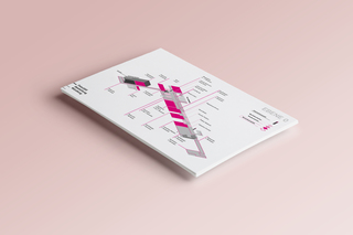
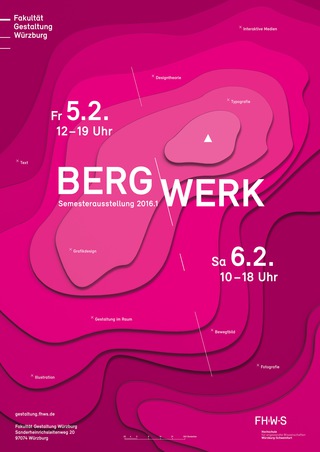
The Faculty of Design in Würzburg Germany has two exhibitions anually. This semester we created in a team of 8 the coporate design for the BERGWERK 2016.1 exhibition. Overall we created a poster, a postcard, invitations, a guidance system and flags.
Early we decided that we wanted to do something new color wise, so Magenta was chosen as the main color scheme. The reason was that the exhibition was in February and the weather is mainly rainy around this year, we wanted a color that was more eye catching between the grey of the weather and between all the other posters in the city. As for the concept we decided on a topographic map, even though the mountain was fictional, the idea was that at the peak of the mountain is the exhibition and that all the work over the semester leads to the top of it. Its the point were everyone gathers and meets.
The topographic layer were lasercut and photographed to give the poster a not too clean look of only digital work, but have a bit of grain and make it more authentic.
Overall the exhibition was a great success and the feedback was very positive.
JavaScript is turned off.
Please enable JavaScript to view this site properly.